 You have an E-purse reload item for this card in your shopping cart.
Please remove it or complete checkout before adding more.
Seattle public transit has a unified payment system called ORCA. if you
use the light rail, there are convenient reload kiosks at ~every station,
but if you primarily take the bus, you might not have any kiosks on your
daily commute path. fortunately, you can reload your card online, so let's
do that. and, since you're probably thinking about this while on the bus,
you'll be using your phone to complete this flow.
what could go wrong? let's find out:
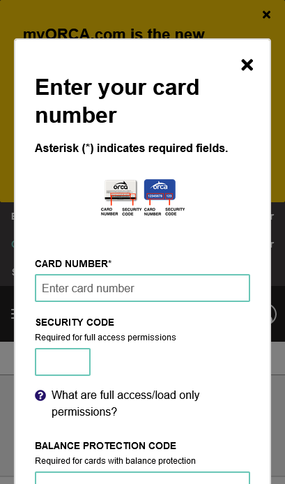
when you open the page, it immediately spawns a modal dialog to prompt
you for a "card number".
the only clarification that this is
the ORCA card number and not your credit card number is in a neighboring
image. hopefully you're not visually impaired!

the next page has no buttons and no input fields immediately visible.
there is nothing here that visually scans as an "Add Funds" option; you
have to explore the accordion sections to find a way to pay.
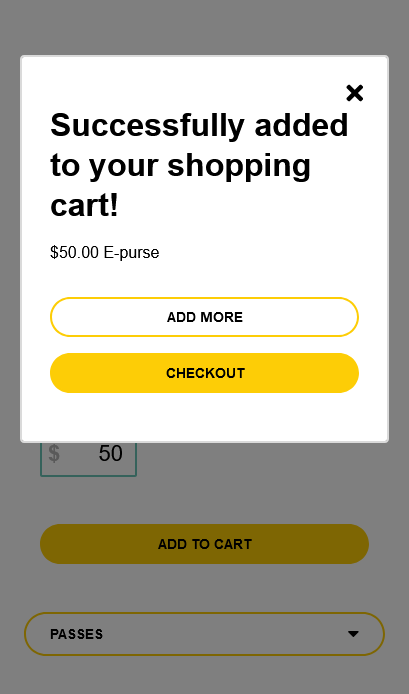
found it! let's go to checkout...
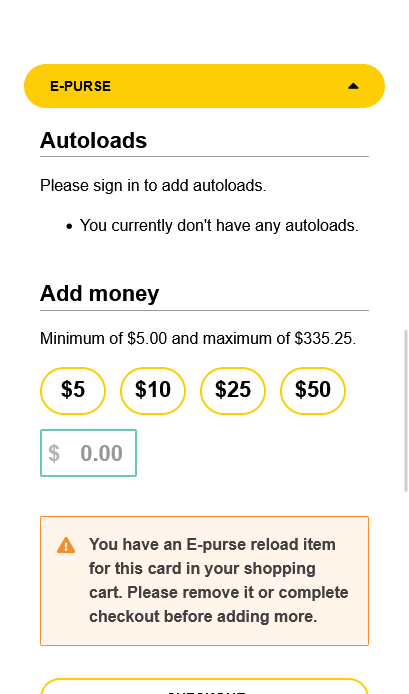
...but first, the page briefly warns you to remove the reload item from
your shopping cart. why???
before you can finish processing this
bizarre request, you get thrown onto another page with an even more
severe error message:
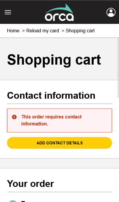
we're supposedly on the "happy path" to checking out, but the website's
visual language has now told us twice in a row that we've done something
wrong.
this time, you have to open the mandatory modal yourself to
proceed.
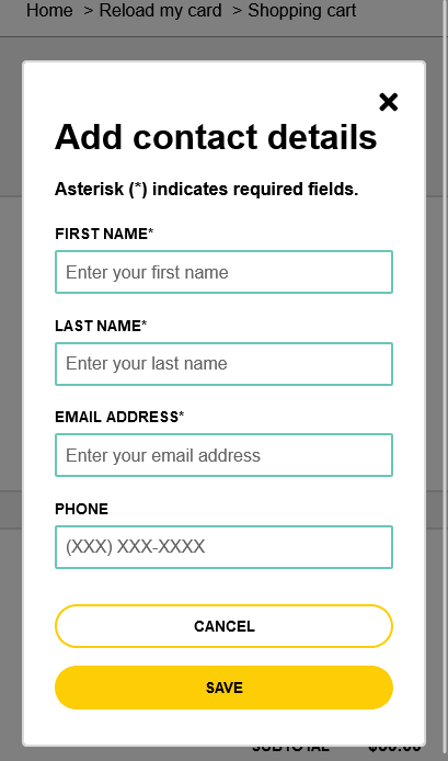
everyone who uses public transit has an email address, right?

the naming of the "Place Order" button seems to suggest that this is the
end of the checkout flow, even though the surrounding messaging clearly
states otherwise.

we're now on our fourth distinct form of the checkout process,
hosted on a completely different website. at least the information we
already provided on the last form is auto-filled here.
in summary: I have never felt so lost trying to pay for something
online. this is a public service meant to be accessible to an entire
city's population, including people who are definitely not tech-literate
enough to navigate this maze of a website. this entire payment flow
could've been two forms with zero modals or confusing error messages. just
an absolute mess